Visualization of Quality Control Metrics#
This module provides functions to visualize quality control metrics for proteomics data.
Autoprot Quality Control Plotting Functions.
@author: Wignand, Julian, Johannes
@documentation: Julian
- autoprot.visualization.qc.charge_plot(df: DataFrame, figsize: tuple[float, float] = (12, 8), chart_type: Literal['bar', 'pie'] = 'bar', ret_fig: bool = False, ax: axis | None = None, **kwargs)[source]#
Plot a pie chart of the peptide charges of a phospho(STY) dataframe.
- Parameters:
df (pd.Dataframe) – Input dataframe. Must contain a column named “Charge”.
figsize (tuple of int, optional) – The size of the figure. The default is (12,8).
chart_type (str, optional) – “pie” or “bar”. The default is “bar”.
ret_fig (bool, optional) – Whether to return the figure. The default is False.
ax (matplotlib axis) – Axis to plot on
**kwargs – Keyword arguments passed to sns.countplot or plt.pie
- Returns:
fig – The figure object.
- Return type:
matplotlib.figure
Examples
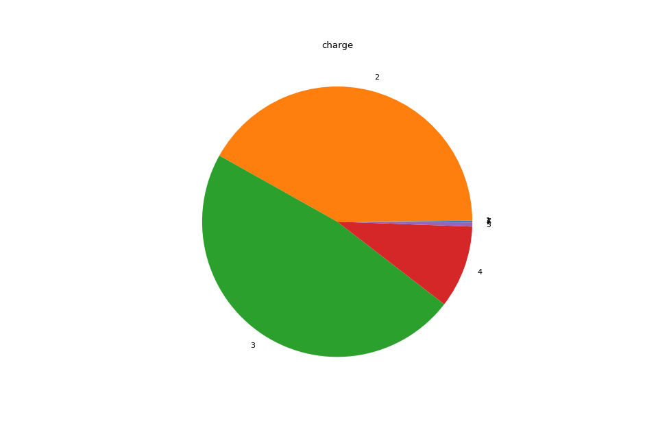
Plot the charge states of a dataframe.
>>> autoprot.visualization.charge_plot(phos, chart_type="pie")
charge [total] - (count / # charge)
[(44, 1), (20583, 2), (17212, 3), (2170, 4), (61, 5), (4, 6)]
Percentage of charge [total] - (% / # charge)
[(0.11, 1), (51.36, 2), (42.95, 3), (5.41, 4), (0.15, 5), (0.01, 6)]
charge [total] - (count / # charge)
[(44, 1), (20583, 2), (17212, 3), (2170, 4), (61, 5), (4, 6)]
Percentage of charge [total] - (% / # charge)
[(0.11, 1), (51.36, 2), (42.95, 3), (5.41, 4), (0.15, 5), (0.01, 6)]
phos = pd.read_csv("../data/Phospho (STY)Sites_minimal.zip", sep="\t", low_memory=False)
phos = pp.cleaning(phos, file = "Phospho (STY)")
vis.charge_plot(phos, chart_type="pie")
plt.show()
(
Source code,png,hires.png,pdf)
- autoprot.visualization.qc.count_mod_aa(df: DataFrame, figsize: tuple[float, float] = (6, 6), ret_fig: bool = False, ax: axis | None = None, **kwargs)[source]#
Count the number of modifications per amino acid.
- Parameters:
df (pd.Dataframe) – The input dataframe. Must contain a column “Amino acid”.
figsize (tuple of int, optional) – The size of the figure. The default is (6,6).
ret_fig (bool, optional) – Whether to return the figure object. The default is False.
ax (matplotlib axis) – Axis to plot on
**kwargs – Keyword arguments passed to plt.pie
- Returns:
fig – The figure object.
- Return type:
matplotlib.figure
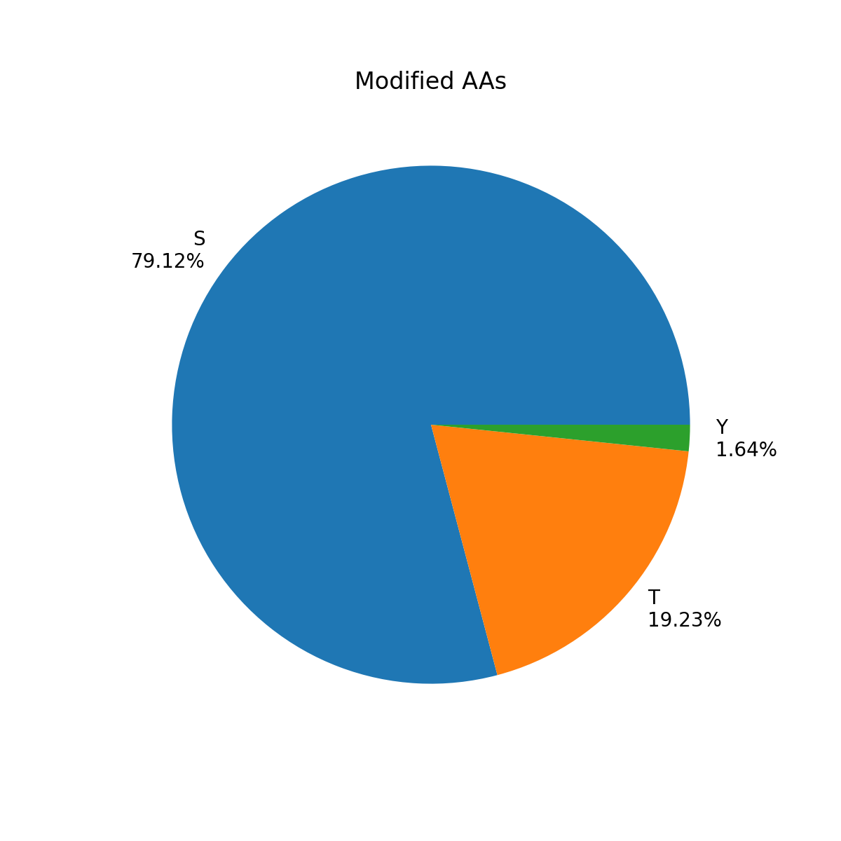
Examples
Plot pie chart of modified amino acids.
>>> autoprot.visualization.count_mod_aa(phos)
phos = pd.read_csv("../data/Phospho (STY)Sites_minimal.zip", sep="\t", low_memory=False)
phos = pp.cleaning(phos, file = "Phospho (STY)")
vis.count_mod_aa(phos)
plt.show()
(
Source code,png,hires.png,pdf)
- autoprot.visualization.qc.icharge_plot(df: DataFrame, chart_type: Literal['bar', 'pie'] = 'bar', ret_fig: bool = False, **kwargs)[source]#
Plot a pie chart of the peptide charges of a phospho(STY) dataframe.
- Parameters:
df (pd.DataFrame) – Input dataframe. Must contain a column “charge”.
chart_type (str, optional) – ‘bar’ or ‘pie’. The default is “bar”.
ret_fig (bool, optional) – Whether to return the figure object. The default is False.
**kwargs – Keyword arguments passed to plotly
- Returns:
fig – The figure object.
- Return type:
plotly.figure
- autoprot.visualization.qc.icount_mod_aa(df: DataFrame, ret_fig: bool = False, **kwargs)[source]#
Count the number of modifications per amino acid.
- Parameters:
df (pd.Dataframe) – The input dataframe. Must contain a column “Amino acid”.
ret_fig (bool, optional) – Whether to return the figure object. The default is False.
**kwargs – Keyword arguments passed to plotly
- Returns:
fig – The figure object.
- Return type:
plotly.figure
- autoprot.visualization.qc.isty_count_plot(df: DataFrame, chart_type: Literal['bar', 'pie'] = 'bar', ret_fig: bool = False, **kwargs)[source]#
Draw an interactive overview of Number of Phospho (STY) of a Phospho(STY) file.
- Parameters:
df (pd.DataFrame) – Input dataframe. Must contain a column “Number of Phospho (STY)”.
chart_type (str, optional) – ‘bar’ or ‘pie’. The default is “bar”.
ret_fig (bool, optional) – Whether to return the figure. The default is False.
**kwargs – Keyword arguments passed to plotly
- Returns:
fig – The figure object.
- Return type:
matplotlib.figure
- autoprot.visualization.qc.sty_count_plot(df: DataFrame, figsize: tuple[float, float] = (12, 8), chart_type: Literal['bar', 'pie'] = 'bar', ret_fig: bool = False, ax: axis | None = None, **kwargs)[source]#
Draw an overview of Number of Phospho (STY) of a Phospho(STY) file.
- Parameters:
df (pd.DataFrame) – Input dataframe. Must contain a column “Number of Phospho (STY)”.
figsize (tuple of float, optional) – Figure size. The default is (12,8).
chart_type (str, optional) – ‘bar’ or ‘pie’. The default is “bar”.
ret_fig (bool, optional) – Whether to return the figure. The default is False.
ax (matplotlib axis) – Axis to plot on
**kwargs – Keyword arguments passed to sns.countplot or plt.pie
- Returns:
fig – The figure object.
- Return type:
matplotlib.figure
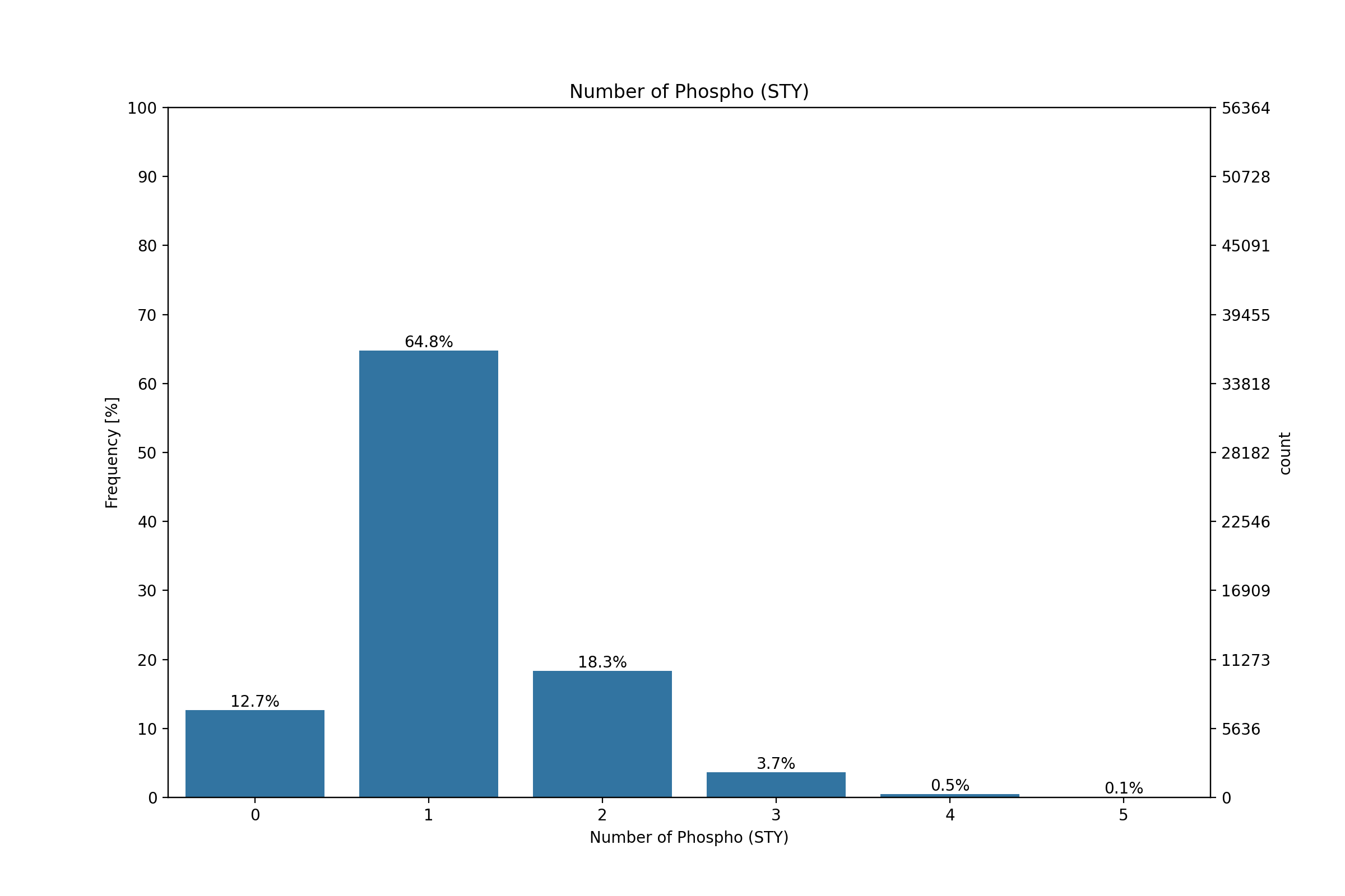
Examples
Plot a bar chart of the distribution of the number of phosphosites on the peptides.
>>> autoprot.visualization.sty_count_plot(phos, chart_type="bar")
Number of phospho (STY) [total] - (count / # Phospho)
[(29, 0), (37276, 1), (16460, 2), (4276, 3), (530, 4), (52, 5)]
Percentage of phospho (STY) [total] - (% / # Phospho)
[(0.05, 0), (63.59, 1), (28.08, 2), (7.29, 3), (0.9, 4), (0.09, 5)]
phos = pd.read_csv("../data/Phospho (STY)Sites_minimal.zip", sep="\t", low_memory=False)
phos = pp.cleaning(phos, file = "Phospho (STY)")
vis.sty_count_plot(phos, chart_type="bar")
plt.show()
(
Source code,png,hires.png,pdf)